Device & Accessories Catalogue Redesign
TELUS redesigned its device and accessories catalogues to address shifting customer expectations, promo complexity, and funnel drop-offs. I owned the end-to-end UX, turning a cluttered browsing experience into a scalable, conversion-focused system.
The Impact
The redesigned catalogue delivered measurable improvements across experience, performance, and support outcomes:
📉 14.7%
Decrease in support tickets and call
📈 8.1%
Increase in traffic to product details page
⚡️ 14.3%
Increase conversion of user landing to our configure page from the catalogue pages
My Role
I led the work from discovery through delivery, partnering closely with Product, Engineering, and Design System teams.
🔬 Led user research and synthesis
🎨 Designed wireframes and high-fidelity prototypes
🖍️ Created and maintained reusable components within the design system
💡 Facilitated cross-functional design workshops
📲 Planned and ran usability testing
Tools used: Figma, FigJam, Miro, Google Meets, Google Docs
Design System: TELUS Universal Design System
The Problem
I uncovered key usability breakdowns in the catalogue through customer feedback and funnel analysis. Dense product cards, ineffective filters, and fragmented promotions increased cognitive load on mobile, directly contributing to higher drop-offs and rising support calls.

Objectives in Focus
To better align customer needs with business goals, I reimagined the device catalogue using insights from market research, user feedback, and design thinking—balancing usability with long-term growth in a flagship experience.
Consumer Goal
Make browsing and selecting devices and accessories simpler, faster, and more confidence-building. Users needed clear filters, consistent product information, and predictable layouts that reduced mental effort.
Business Goal
Build a scalable, future-ready catalogue capable of supporting frequent promotions, new device launches, and long-term growth—while improving funnel performance and reducing operational support costs.
How did I do it?
The Process
I began by grounding the redesign in real user behavior and market context.
Methods
Competitive analysis across leading telecom and retail catalogues
UX and UI audit of the existing TELUS catalogue
Stakeholder interviews with Product, Care, and Engineering
Participants
10 internal stakeholders (Product, Engineering, Care, Analytics)
Analysis of anonymized behavioral data from thousands of sessions
Key Insights
Users struggled to compare products due to inconsistent hierarchy and dense cards
Filters felt outdated and required too much effort to refine results
Promotions lacked visual priority, forcing users to hunt for value
Inconsistent visuals reduced trust and increased hesitation
These insights directly shaped the redesign strategy: reduce cognitive load, improve scanability, and surface value clearly.


Key Findings That Drove Design Decisions
🔍 Filtering was outdated → Users couldn’t narrow results quickly
🔍 Promotions lacked clarity → Value wasn’t obvious at a glance
🔍 Weak content hierarchy → Users felt overwhelmed and uncertain
🔍 Inconsistent visuals → Reduced confidence and perceived quality
Each issue became a design constraint the new system had to explicitly solve.
Wireframe Exploration
The wireframes translated research insights into concrete structure and flow.
Why This Approach
I intentionally moved toward simpler layouts and fewer competing elements to reduce decision fatigue—especially on mobile, where most catalogue traffic originated.
Key Decisions
🖍️ Redesigned filters to be clearer, faster, and more discoverable
🔬 Standardized product cards into a single-column layout to improve scanability and comparison
🎨 Introduced larger imagery and whitespace to guide attention and reinforce hierarchy
Each artifact addressed a specific pain point:
Filters → Reduced friction in narrowing choices
Product cards → Improved comparison and pricing clarity
Layout system → Enabled scalability without visual clutter


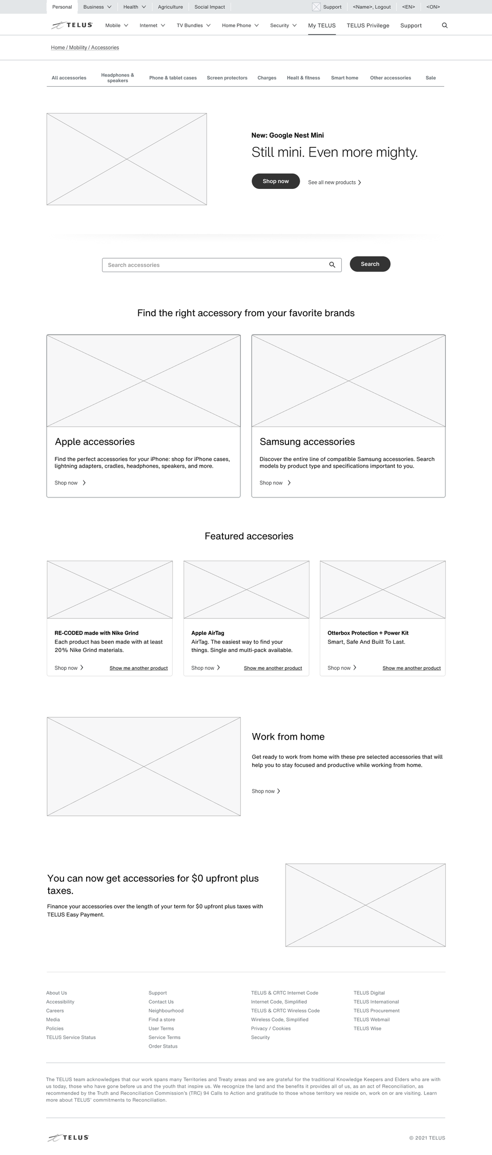
Accessories Landing Page Exploration
In parallel, I explored a marketing-led accessories landing page.
Opportunity Identified
Accessories lacked storytelling and emotional engagement despite strong promotional potential.
Design Rationale
Spotlighted top products and categories to support discovery
Integrated promotions and TELUS Social Purpose content to add meaning and differentiation
Created a flexible template that could evolve with campaigns and seasons


Designing Through Real Feedback
Usability Testing
I validated the mobile end-to-end journey through multiple rounds of testing.
Testing Details
📲 Format: Interactive Figma prototypes (mobile)
🖌️ Environment: Remote sessions via Google Meet (recorded)
⭐ Participants: 12 participants (TELUS and non-TELUS customers), diverse ages, incomes, and industries
⏱️ Duration: 45-minute sessions across two testing rounds
Key Findings
Users found the flow intuitive with minimal explanation
Highlighting top products and promotions improved confidence
The updated filtering system significantly reduced time to decision
Surprising Insight
Several users explicitly noted they felt “less pressure to choose fast,” indicating reduced cognitive stress—a signal that the hierarchy and spacing were working as intended.

From Clutter to Clarity: The Final Designs
Building on the accessories success, I extended the same principles to the mobility device catalogue, which had an even higher volume of promotions.
Why This Design Worked
-
Promotions were embedded directly into listings instead of competing with them
-
Clear hierarchy ensured incentives were visible without overwhelming content
-
A consistent card system allowed for rapid updates without breaking layout logic
This approach balanced marketing needs with usability—supporting both conversion and clarity.

Final Thoughts
This project reinforced that clarity is not about removing content—it’s about controlling attention. By intentionally designing hierarchy, spacing, and systems, I transformed a high-noise catalogue into a confident, decision-ready experience.
Current Status
The redesigned catalogue is live and actively supporting device and accessory sales across TELUS digital channels.
Expected Impact
Continued reduction in support calls
Improved scalability for future promotions and launches
Stronger conversion performance across mobile and web
Key Learnings
Reducing cognitive load directly impacts business metrics
Design systems are most powerful when stress-tested against real complexity
Clear hierarchy builds trust as much as it improves usability

© 2025 | Fenil Shah
